
Wednesday, 29 December 2010
Planning: Digipak mock-up


Ideally, I want to create a digipak that has a flowing graphic design and colour scheme which conformed to the conventions of the genre. I wanted to have a wire theme, to show the importance of the electric rocky sound within the bands music. The conflicting black, white and red are something that I'd associate also with genre and other rock albums.
Monday, 20 December 2010
Planning: Shortlist of photos


Planning: Do's and Don'ts of design
In order to create a convincing and professional looking digipak and advert we were given a guide of dos and don'ts to follow.
Do:
Do:
- Use clear fonts and photos in an appropriate size/shape.
- Use a layout that follows the rule of thirds for composition.
- Appropriate font that follows genre conventions; position text to conform to conventions
- Follow the three colour rule and choose colours that are appropriate for images, font and backgrounds.
- Think carefully about how you use and intergrate images, font, text and language. (anchoring meaning putting images with text)
- Use approprate industry logos, conventions properly positioned.
- Stretch images.
- Use Layer styles.
- Use effects that do not fit the genre.
- Place text across artists face.
- Use a font because you 'like it'
- Feel the need to use separate images on each panel.
Planning: shortlist of fonts, colours, layout and design ideas.
FONTS:
After looking at number of digipaks the fonts on each are very basic, usually capitalised and artist/band names are substantially bigger than the album title. Below are a few fonts that i have chosen as possibilities for my digipak and advert.
 COLOURS:
These are the colours that I think could fit the genre of the band. I'd like to use only two or three colors throughout the whole digipak and the advertisement.

After looking at number of digipaks the fonts on each are very basic, usually capitalised and artist/band names are substantially bigger than the album title. Below are a few fonts that i have chosen as possibilities for my digipak and advert.

These are the colours that I think could fit the genre of the band. I'd like to use only two or three colors throughout the whole digipak and the advertisement.

LAYOUT:
I want to use a very basic image, either of the band or something that links to the band for example, a cluster of instruments used in the music video. Id like the the band name and album title in bold text in two different colours in the top right area of the cover. The track listings will be on the back in a conventional listed paragraph in the same text used on the front. The inside of the digipak will contain extra information on the tracks listed one outside cover.
Monday, 13 December 2010
Inspiration
For my Digipak i wanted to use the below Logo of the classic Mod logo used by the who and of course the mods. Both the Mods and The Who have references to Indie and Rock and i thought by using this logo it would create a Indie feeling and to be known as a British Band as this logo has references to Britain's with the colours of the British flag red white and blue.

Analyse of Three Digipaks
The Kooks Digipak Inside In The Inside Out was one digipak that i found both interesting and inspirational for my own digipak and i also believe it fits with both my category of Indie and would be bought by the same audience who will buy mine as The Kooks and my band are both an Indie band.

What I like about this digipak is the feeling for both instruments and the closeness of the band by just hanging out with instruments. the reason why i like this is because for me and my group we wanted to create the feeling of both us writing our own music and have a love for music I.E. the instruments will be used heavily in my digipak and also the jamming as it will support my music video and the digipak of the band hanging out.
Arctic Monkeys Whatever People Say I Am That's What I'm Not:
The reason why I like this digipak is different to the reason why i like the Kooks Digipak is because with this one it still manages to create the feeling of Indie but is different towards The Kooks as this one is more creative with the theme of smoke which i could use in mine as you could say smoking is a symbol of a classic Indie band.

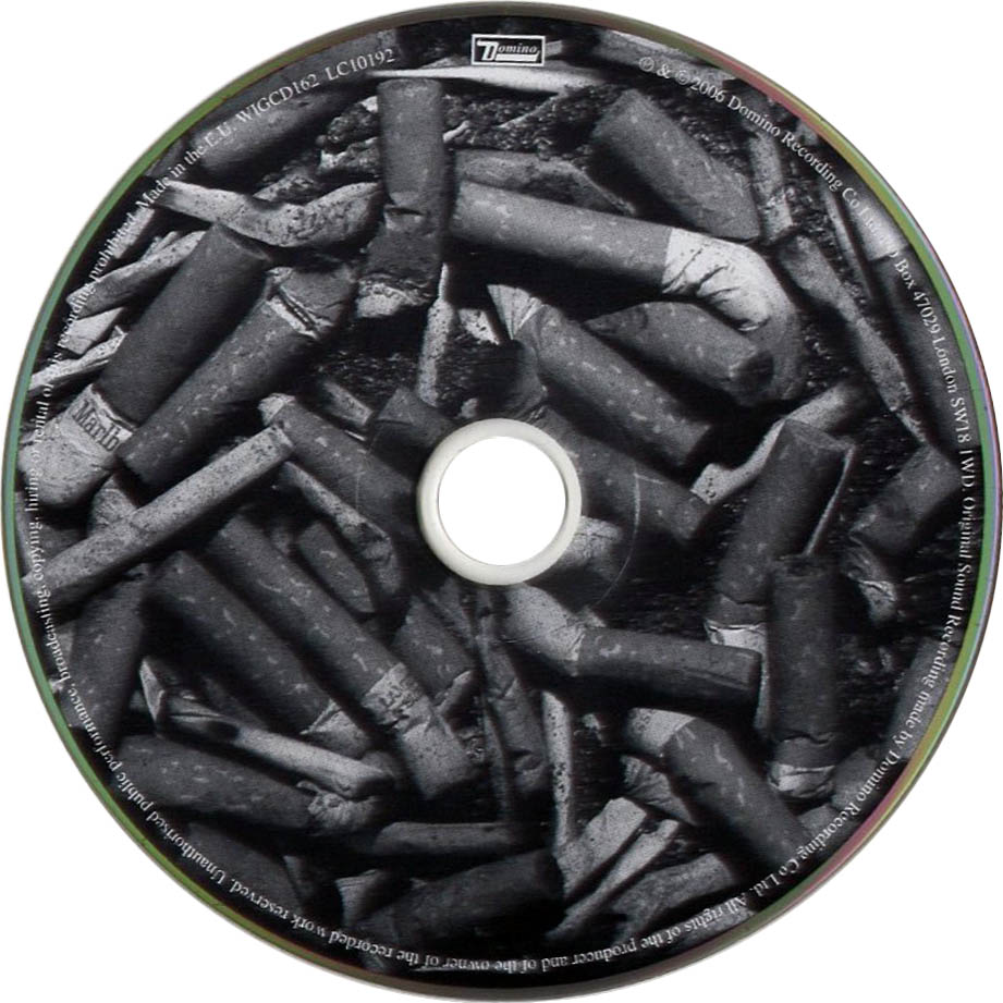
The theme of smoking with the CD looking like an ashtray and the front cover of the artist smoking a cigarette for me is both very affective and creates the Indie vibe and i could use it in my digipak.
The who Greatest Hits Digipak:
I found my third idea of inspiration in a old band but who are also rock. even though The Who are not seen as a Indie style band i still think my audience will buy this album and be interested in this band. the reason why i like this digipak is because i like the black and white theme like for Arctic Monkeys which help to create the Indie vibe. but apart from the colour scheme i also like the image of Great Britain Flag flying at the bottom which shows it is a British band which i like as in our video we used the theme of London so this idea could work as a good combination of both Indie and English band.

Research: Digipak Anlysis
In order to create a genuine looking digipak we were asked to look at a selection of digipaks that fit the genre of music our band fit into and outline how it fits the genre and audience.
 'Unplugged' by all time low is a special edition CD of live tracks. The album cover clearly shows us who is in the band; from the instruments and clothing worn we get an idea of the indie rock genre. The instruments in our music video play an important part of emphasizing the genre. The front cover image allows the audience to get a clear view of what the band are about and the performance aspect in the image front shows us that they are passionate about music and not gimmicky. The inside panels of the digipak are images of the ban performing to a very small audience. The colours are very much the same as inside as they are on the front cover.
'This is war' by 30 seconds to mars is a very basic design where only a few colours are used. The dark colours could suggest a darkness in the lyrics of the bands songs which the audience are used too and the darkness the genre and connote. The front and back panels of the digipak have the word 'war' taking up majority if it with the rest of the album title very small within the word. The digipak has a very different image to the one featured on the CD, as so the only thing creating a link is the band name across the bottom and album name. The use of text and no actual band image is something I may consider doing in my digipack.

'Come around sundown' by Kings of Leon has quite a simple digipack cover. The same shades of orange are used though-out the digipak as wells as very similar beach images. There is a huge sense of familiarity between the digipak and the CD as they both have the same olouring and very similar photos on the digipak. The images relate to genre of the music and the bands personality, which i would consider to be quite laid back.
Research: Advertisement Analysis


This advertisement uses a similar colour scheme as the above, but uses it to create a dark atmosphere. It features an image of the band members and the CD cover it is advertising. The text on the poster is capitalized and makes it stand out, particularly the bad name in white on black background. The image has been edited to fit a pop art theme which is seen of the rock genre, like on The Beatles albums.


Both digipak and advert employ the same colour filter over the images, the advertisement features an image of the album and the band, this create different a relaxed atmosphere and can give an indication of the relaxed styles of the rock genre they produce. The clothing the band wear is one thing that gives away the genre also,
Subscribe to:
Posts (Atom)